
Enter password to view case study
A better workspace for Customer Support

Overview
A customer management tool needs to support different teams doing different kinds of work. But this one forced everyone into the same fixed, three-column layout, even though most users worked on MacBook Airs.
Customer conversations sat on the left, while customer information and actions were pushed into a separate panel on the right. The layout was difficult to use on smaller screens, and the interface didn’t adapt well to different workflows.
This is a look at how I redesigned the workspace: reworking the layout, introducing browser-inspired customer navigation, and adding dedicated CRM and knowledge base tabs to help teams find the context and tools they need.
ROLE
Lead product Designer
COMPANY
ANNA Money
Timeline
2025
SKILLS
Product Design, User research, Workflow design
The problem
The tool supported several teams, including customer operations, compliance, business accounts, and developers troubleshooting issues in the app.
Most users worked on MacBook Airs, but the fixed three-column layout was difficult to use on smaller screens.
The interface assumed one way of working, with little flexibility for different teams’ workflows.
Some controls were placed in unintuitive locations, making the interface harder to navigate.
Typically agents are handing around 10-15 customers in one go, sometimes the tiles on the left are for the same customer but a different ticket type.
No sorting for the open/active customers
Difficulty to understand queue volumes, especially when you're chatting with multiple customers.

Design goals
Make better use of screen space so the workspace is comfortable to use on MacBook Air displays.
Support different team workflows across customer operations, compliance, business accounts, and developers.
Make customer context and key actions easier to find by giving information a clearer place in the interface.
Create a more adaptable workspace that can accommodate different tasks without forcing every user into the same layout.
Designing the solution
I redesigned the workspace to give customer conversations a dedicated space on the left and customer information and actions a dedicated space on the right, with browser-inspired navigation across the top to help agents move between customers.
Early concepts
I explored several layout ideas, including:
Keeping the left panel, but making it scalable to provide flexibility
Create a top bar, similar to the experience of a web browser
Improvements to the right hand panel

Defining the pattern
The new layout pattern used a two-column workspace with a top navigation bar.
Customer conversations and interactions take place in the left-hand panel.
Customer information, actions, and workflows are available in the right-hand panel.

The top bar was inspired by browser tabs, giving agents a familiar way to move between customers and other parts of the tool. It could also support new types of tabs, including CRM, dashboards, and the knowledge base.
When agents were actively talking to customers, the newest messages moved to the front of the tab queue. This made active conversations easier to spot, including those that would otherwise have been hidden in the overflow.


The comparison
The redesigned tool was intended to better support users with different skills and workflows. The main changes included:
Replacing the three-column layout with a two-column workspace and top bar navigation.
Making customer queues easier to see.
Opening internal links in new tabs instead of a separate browser window.
Making the left, right, and chat input panels resizable by dragging, with each panel retaining its last-used size.
Moving the block mode selector to the sidebar navigation.
Adding dedicated tabs for CRM, cases, and the knowledge base.
Making the customer’s source clearer, such as a new chat, a returning conversation, or a case linked to the customer.

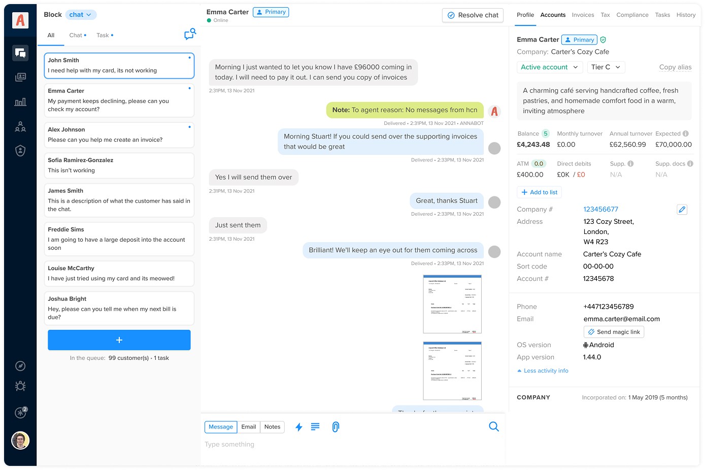
Shipping to production
We released the initial updates to a beta environment so agents could familiarise themselves with the new layout. I facilitated a design critique with agents from different business areas. Feedback was minimal and focused mainly on fixing code bugs and refining how new and unread messages were prioritised. We made those adjustments before releasing the product to the live environment.